Designing a Data-Driven Narrative Around AI and Human Collaboration in Marketing
Designed a comprehensive thought leadership report and supporting infographic exploring how marketing organizations are integrating AI with human expertise to drive performance.
This project translated complex research and abstract concepts into a clear, structured visual system that could scale across both long-form and condensed formats.
Role: Designer
Scope: Report design, infographic, visual system, campaign assets
Sponsors:
-
The report focused on a nuanced and rapidly evolving topic: the relationship between AI and human marketers in driving business performance.
The challenge was to:
Communicate complex, data-heavy insights clearly
Build a compelling narrative across multiple sections and themes
Create a visual system that could scale from a full report to a concise infographic
Maintain engagement for a professional, marketing-focused audience
-
I approached the project as both a storytelling and system design challenge, developing a flexible visual framework to support clarity, consistency, and scalability.
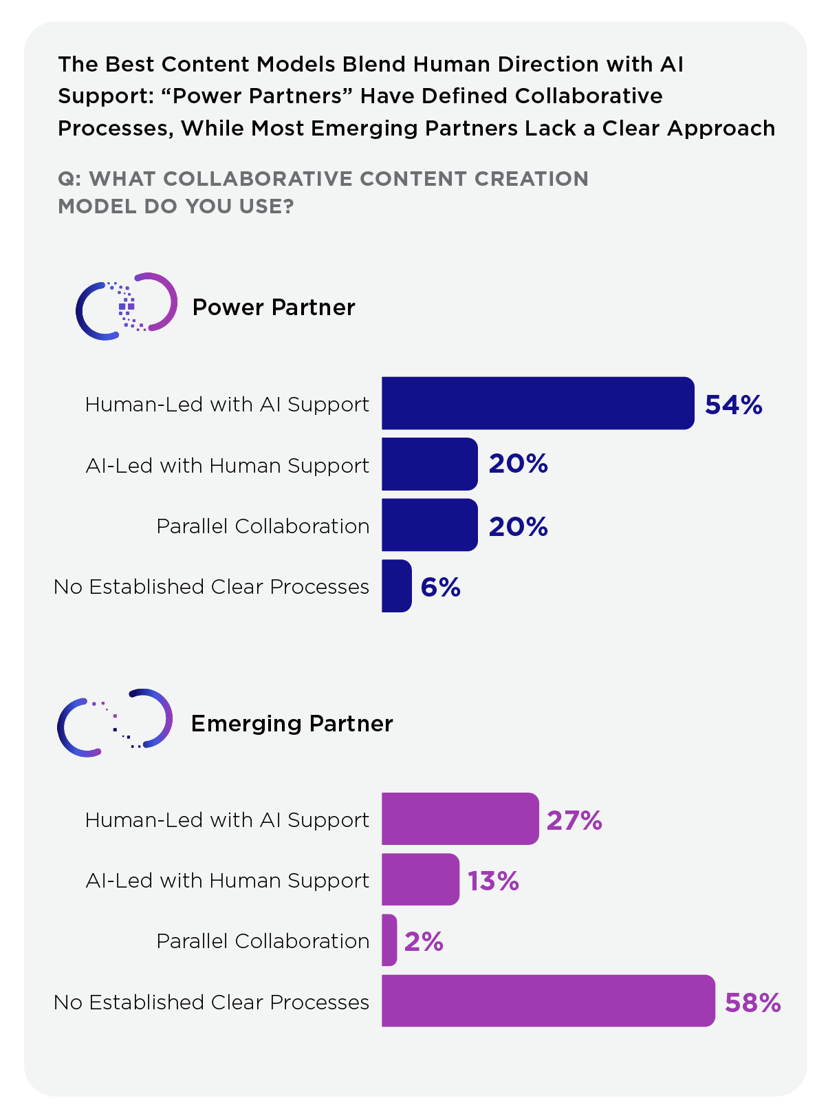
Established a central narrative structure (“Power Partners vs. Emerging Partners”) to guide the entire report
Built a modular layout system to support long-form content and varied data visualizations
Created a clear visual hierarchy to improve the readability of dense information
Designed reusable components for charts, callouts, and key insights
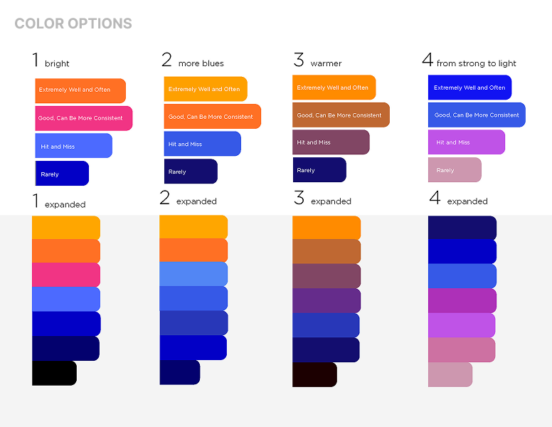
Developed a consistent color and icon system to differentiate themes and reinforce meaning
-
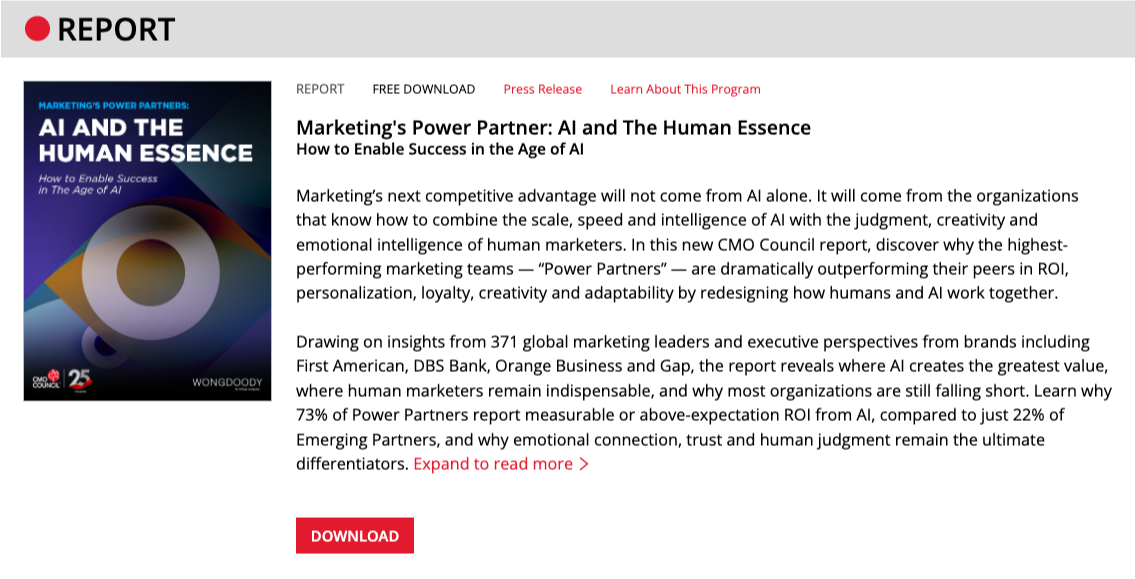
The final deliverables included a full-length report and a condensed infographic designed for broader distribution and faster consumption.
Report
Structured multi-section document covering AI adoption, workflow transformation, and performance insights
Designed layouts to balance data visualization with editorial content
Applied consistent systems across charts, typography, and visual elements
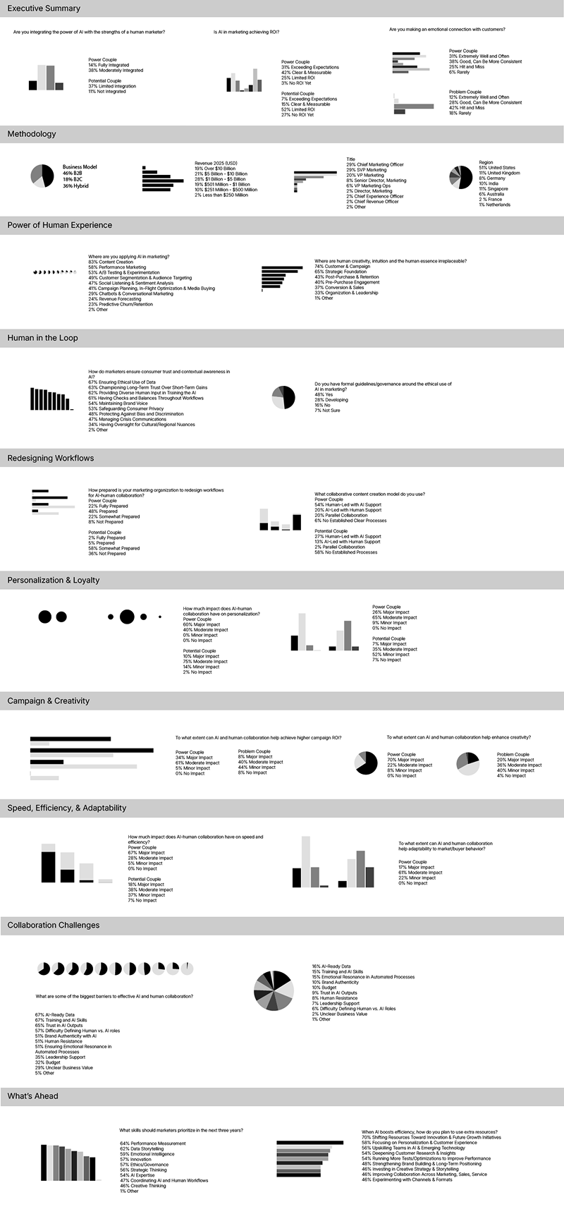
Infographic
Translated key findings into a streamlined, high-impact format
Prioritized scannability and visual storytelling
Maintained alignment with the report’s visual system while simplifying complexity
Design Process
●
Design Process ●
Data Visualization
Designed charts and graphs in Illustrator for seamless integration into InDesign layouts, simplifying complex data and introducing varied chart types to maintain visual interest and avoid repetition, while using data visualizations to inform layout structure and guide the overall narrative flow of the report.
Wireframing the Structure
Built initial wireframes in InDesign to define layout, grid, and content flow, establishing hierarchy for headlines, body copy, and data sections, and creating a flexible framework to support multiple content types.
Content Layout
Placed and structured copy within the wireframe to refine pacing and readability, balancing editorial content with visual elements to avoid overwhelming the reader and adjusting layouts to improve clarity and flow across sections.
Integrating Data & Visuals
Imported charts into layouts and refined their placement for maximum clarity, ensuring consistency across all data visualizations and supporting elements, and iterating on spacing, alignment, and hierarchy to maintain a cohesive system.
Visual Direction
Developed a cohesive color palette and visual language tailored to the report's themes, applying color strategically to charts, and drawing attention to key insights, while refining typography, iconography, and supporting graphics to create a polished, consistent system throughout.
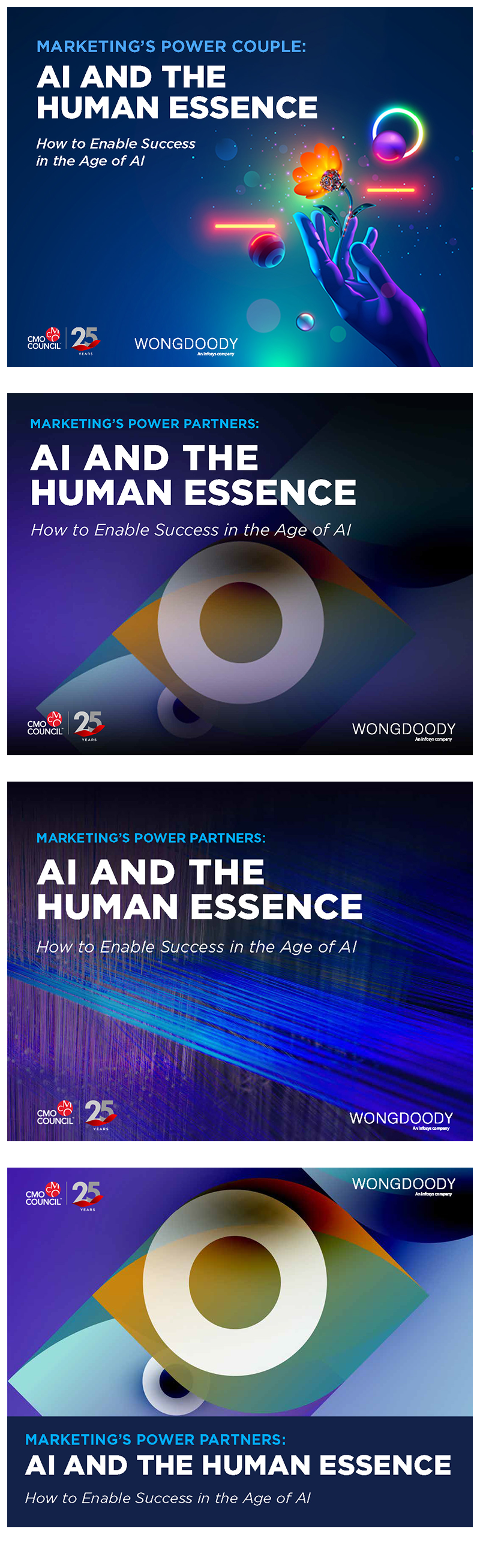
Finalization & Cover Design
Collaborated with the client to define and refine the final cover direction, ensuring it aligned with the report's core concept, then finalized layouts and assets to maintain consistency across all report and campaign materials.
From Report to Infographic
A key part of this project was distilling a dense, multi-section report into a single, cohesive infographic.
This required:
Identifying the most important insights
Simplifying complex data without losing meaning
Reframing content into a clear, linear narrative
The result was a format that supported both deep exploration (report) and quick understanding (infographic), extending the reach and usability of the content.
The Impact
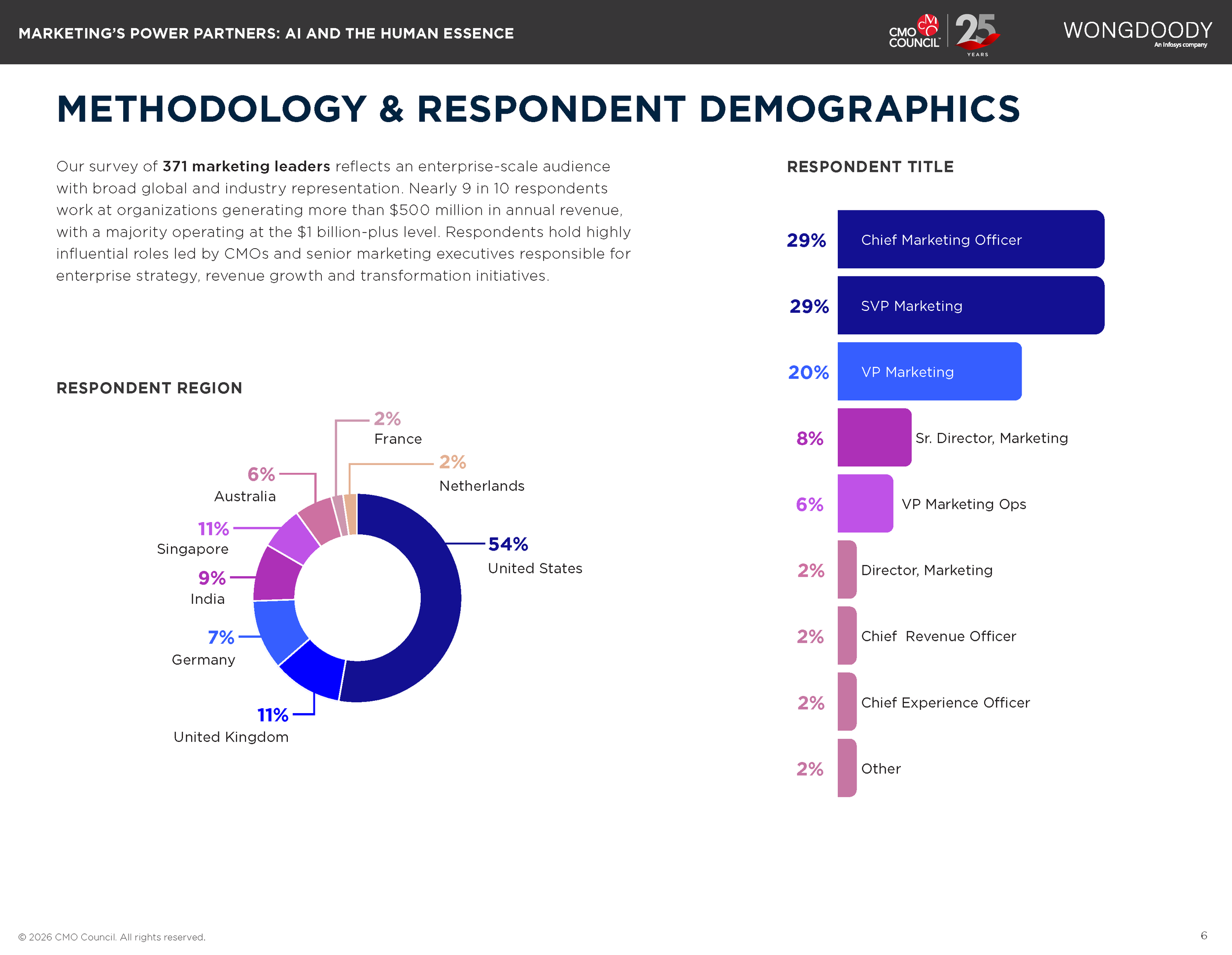
Supported a global research study of 371 marketing leaders across enterprise organizations
Enabled consistent storytelling across report, infographic, and campaign assets
Created a scalable visual framework for future thought leadership content
Improved clarity and accessibility of complex AI and marketing concepts
Key Takeaways
Complex topics benefit from strong narrative structure and clear visual systems
Designing for multiple formats requires flexibility and consistency from the start
Simplifying information is as important as presenting it
Digital Assets
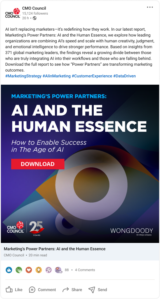
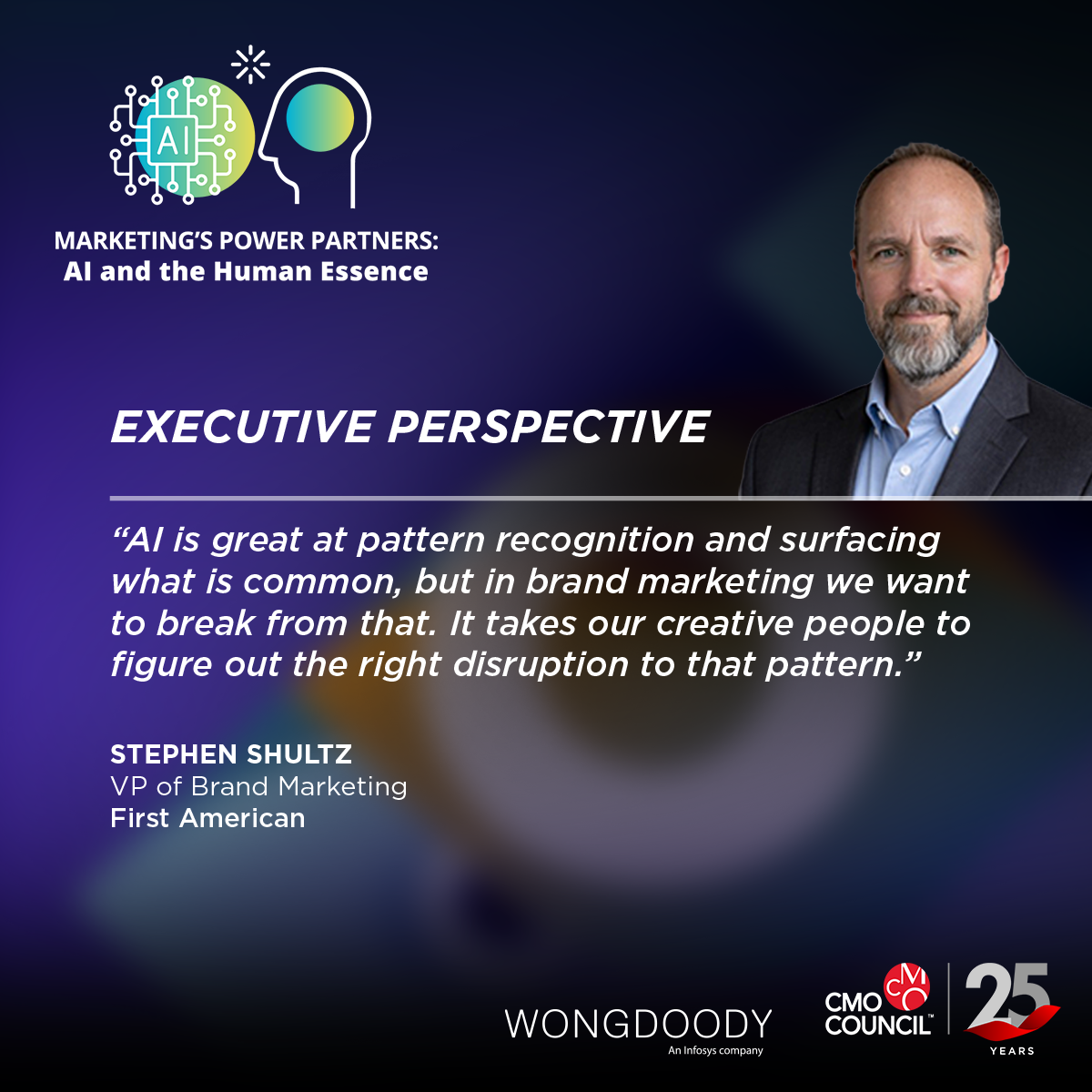
Designed social media assets and web banners to promote key insights from the report, optimized for LinkedIn and the CMO Council website, and developed thumbnail visuals to integrate the report into its dedicated landing page and support downloads.