Designing a Data-Driven Narrative Around AI and Human Collaboration in Marketing
This project translated complex research and abstract concepts into a clear, structured visual system that could scale across both long-form and condensed formats.
Role: Designer
Scope: Report design, infographic, visual system, campaign assets
Sponsors: WongDoody & the CMO Council
The Challenge
Communicate complex, data-heavy insights clearly
Create a cohesive visual system that works across deliverables
Make it engaging for a professional, marketing-focused audience
The Approach
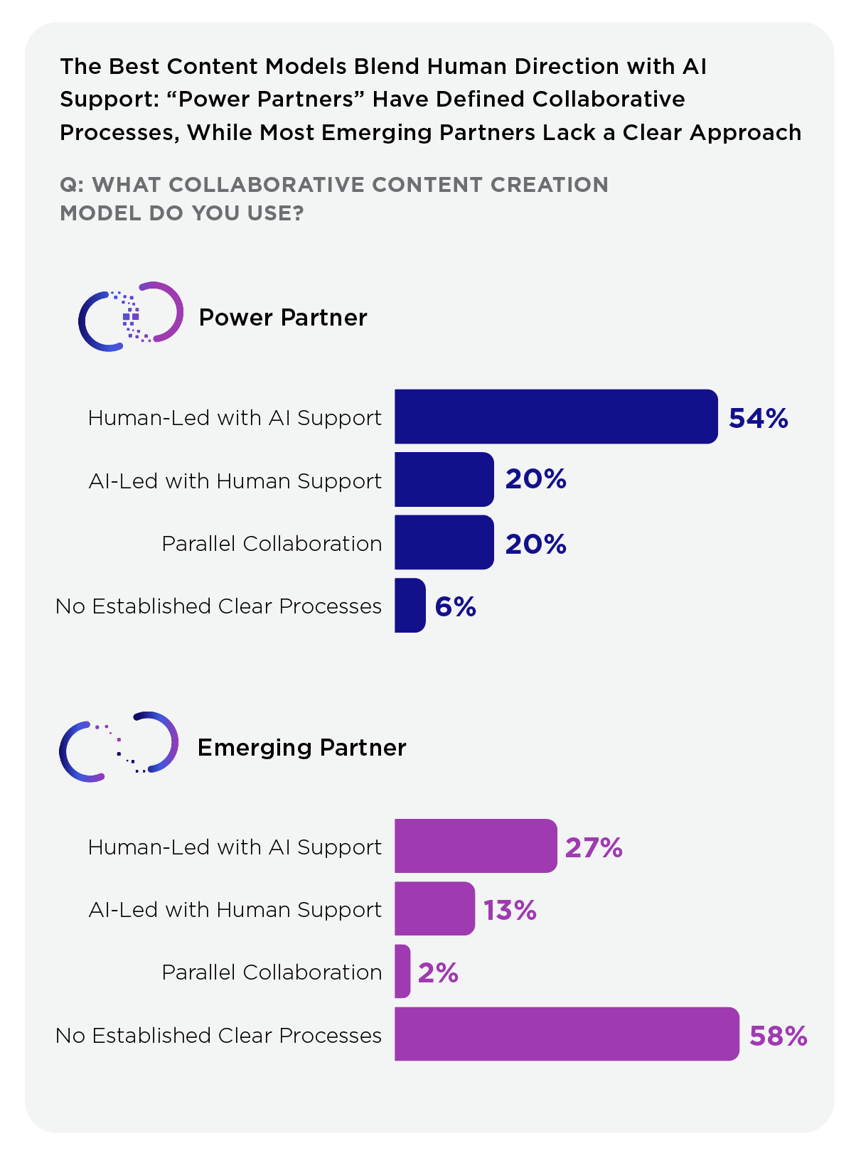
Created icons for the central narrative of “Power Partners vs. Emerging Partners” to guide the entire report
Developed a layout system that balances dense copy and data visualizations
Designed consistent and reusable treatments for charts, callouts, and key insights
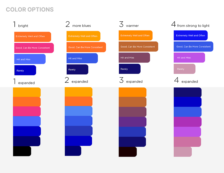
Developed a consistent color palette to differentiate data and reinforce the visual theme
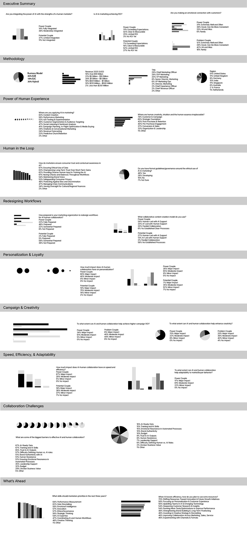
Infographic
Translated key findings into a streamlined format
Prioritized scannability and visual storytelling
Implemented the visual system to tie it back to the main report
The Execution
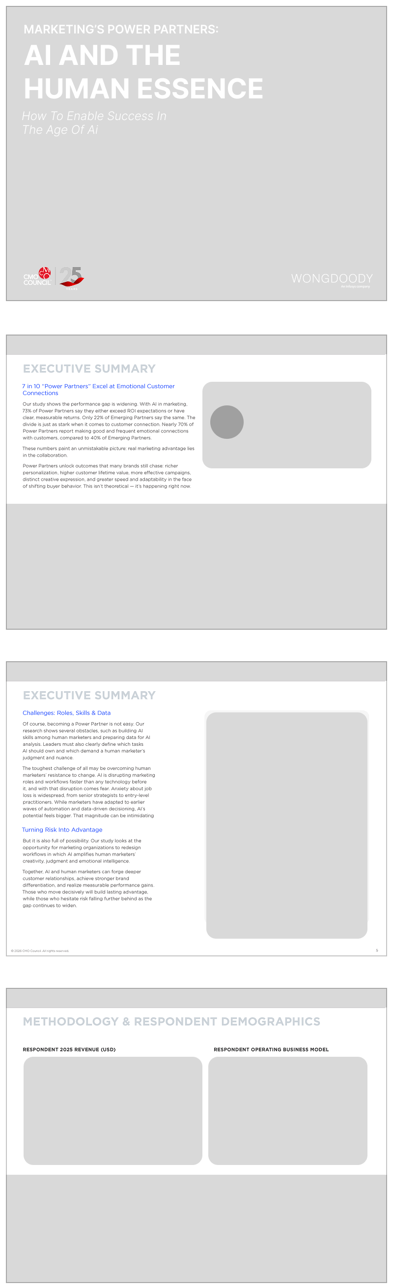
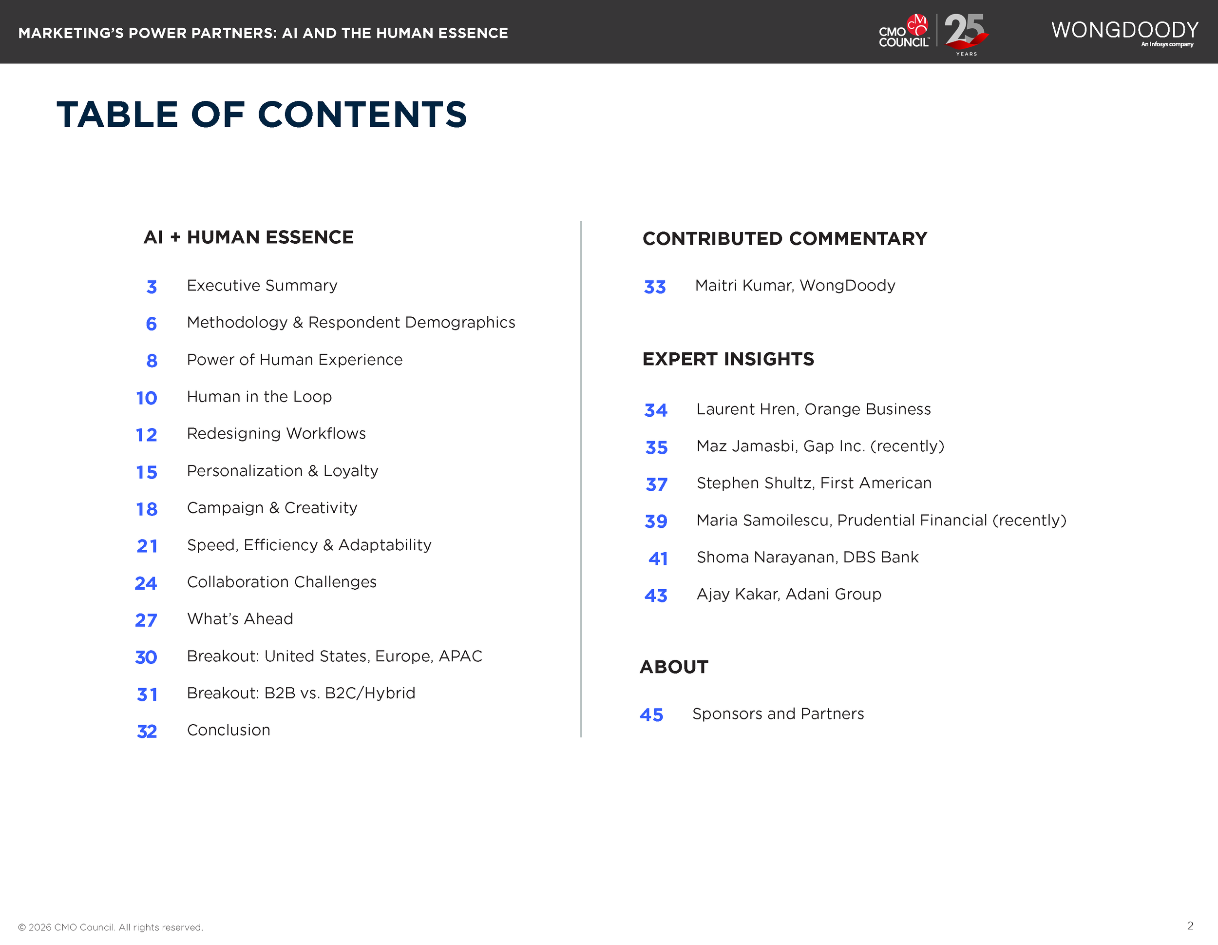
60+ PageReport
Structured multi-section document including data charts, key takeaways, quotes, and executive insights
Balanced and varied layouts to maintain flow
Cohesive design systems across charts, typography, and visual elements
Building the Visual System
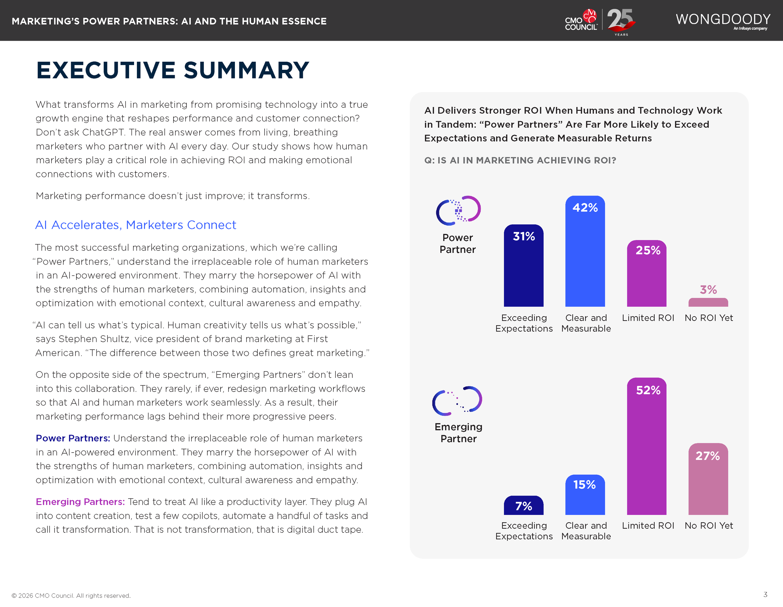
Create simple data charts in Illustrator and determine chart styles.
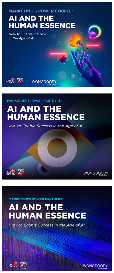
Explore cover options and gather feedback from stakeholders.
Flood the copy into our
report template in InDesign, breaking up content for easier readability.
Develop color palette options based on the client’s existing branding and the report cover image.
Import charts to the report template, adding visual elements to enhance clarity.
Finalize the report after rounds of feedback and package the files for the client.
Note: this is a shortened version of the report for portfolio purposes.
The Result

The Supporting Infographic
Pulls elements from the report to tie the pieces together
Data charts, icons and illustrative elements help translate
the information quickly
Using the bright colors to emphasize the most important takeaways

The Impact
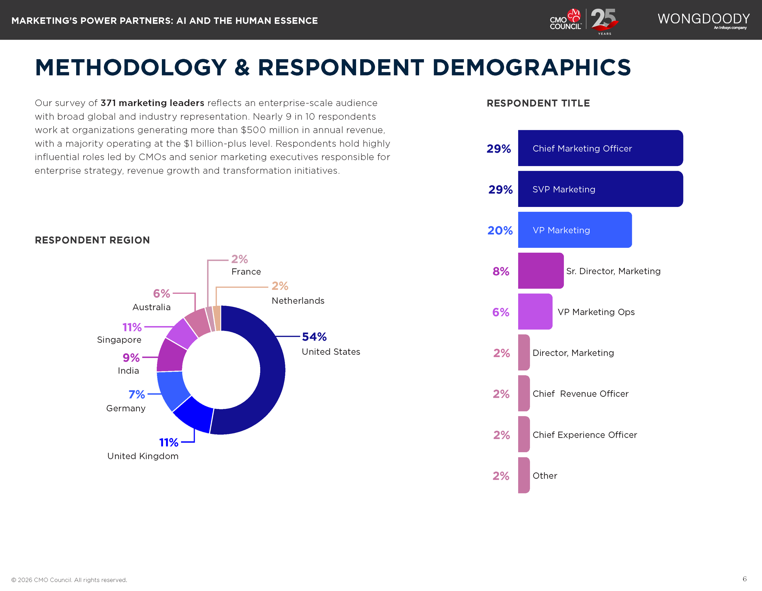
Supported a global research study of 371 marketing leaders across enterprise organizations
Enabled consistent storytelling across report, infographic, and campaign assets
Improved clarity and accessibility of complex AI and marketing concepts
Uses typographic hierarchy to emphasize the main sections of information
Applying color coding and gradients allows for information to pop
Ties back to the report at the bottom with a visiual reference to simplify it for the audience
Key Takeaways
Complex topics benefit from strong narrative structure and clear visual systems.
Designing for multiple formats requires flexibility and consistency from the start.
Simplifying information is as important as presenting it.